SwiftUI之 VStack、 HStack、 ZStack
在 SwiftUI 中,我们会经常使用到 VStack、HStack、ZStack 来帮助我们进行布局。
VStack
在VStack中的子视图都将按照垂直方向进行排列。
例如:1
2
3
4
5VStack {
Image(systemName: "globe")
Text("Hello, World!")
.font(.body)
}
此时的布局效果如下:

HStack
和VStack 类似,不过 HStack是将子视图按照水平方向 进行排列。
类似地,将上面示例代码中的VStack 改为HStack :1
2
3
4
5HStack {
Image(systemName: "globe")
Text("Hello, World!")
.font(.body)
}
效果如下:

对于 VStack 和 HStack 而言,都可以设置它们子视图之前的间距spacing 和对齐方式alignment 。
区别在于,VStack 的对齐方式有:
center:居中对齐;leading:左对齐;trailing: 右对齐。
HStack 的对齐方式有:
center:居中对齐;top:顶部对齐;bottom:底部对齐。
1 | VStack(alignment: .leading, spacing: 10) { |
1 | HStack(alignment: .top, spacing: 10) { |
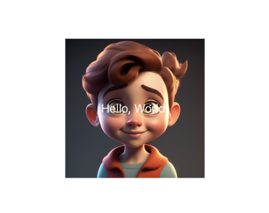
ZStack
ZStack 是让子视图按照Z轴方向 堆叠排列。1
2
3
4
5
6
7
8ZStack {
Image("avatar")
.resizable()
.frame(width: 200, height: 200)
Text("Hello, World!")
.font(.body)
.foregroundStyle(.white)
}
效果如下:
ZStack 只能设置对齐方式alignment,它的对齐方式包括:
top:顶部对齐;bottom:底部对齐;center:居中对齐;leading:左对齐;trailing: 右对齐;topLeading:左上角对齐;topTrailing:右上角对齐;bottomLeading:左下角对齐;bottomTrailing: 右下角对齐。
布局示例
VStack
1 | struct VStackContentView: View { |
HStack
1 | struct HStackContentView: View { |
ZStack
1 | struct ZStackContentView: View { |
VStack、 HStack和 ZStack 一起使用
1 | struct LayoutDemo: View { |
ContentView
1 | struct ContentView: View { |
效果如下: