SwiftUI控件之 Button(一)
在 SwiftUI 中,Button 是一个视图,它可以响应触摸点击事件。Button 视图有一个基本的结构,包括标题(label)和动作(action)。动作是一个在按钮被点击时触发的函数。
按钮的定义
下面是一个简单的 Button 示例:1
2
3Button("按钮") {
print("按钮被点击了")
}
在上面的代码中,我们定义了按钮的文字按钮和点击的响应事件print("按钮被点击了")。除了这种方式,我们还可以使用另外一种常用的方式定义一个按钮:1
2
3
4
5Button {
print("按钮被点击了")
} label: {
Text("按钮")
}
在后面的这种方式中,我们是使用一个Text("按钮") 作为按钮的label,这样做的好处是可以更多的自定义按钮标题的样式。1
2
3
4
5
6
7Button {
print("按钮被点击了")
} label: {
Text("按钮")
.foregroundStyle(.black)
.background(.gray)
}
除了使用Text 作为label 的要显示的内容,也可以使用其他的控件,例如Image。1
Image(systemName: "apple.logo")
按钮的样式
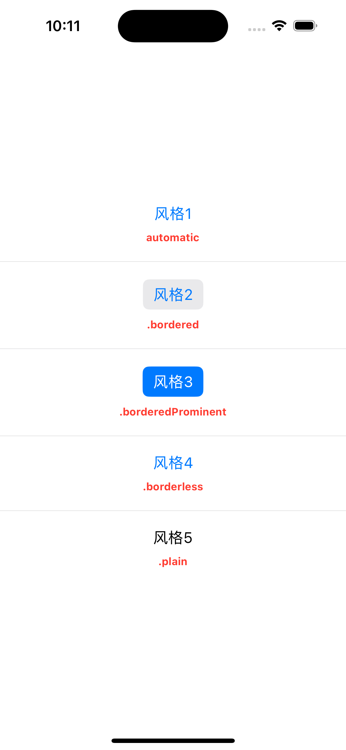
Button的风格可以通过 .buttonStyle 修饰器来进行修改,我们可以定义以下的几种风格:
automatic、bordered、borderedProminent、borderless和plain。1
2
3
4
5
6
7
8
9
10
11
12
13
14
15
16
17
18
19
20
21
22
23
24
25
26
27
28
29
30
31
32
33
34
35
36
37
38
39
40
41
42
43
44
45
46
47
48
49
50
51struct ContentView: View {
var body: some View {
VStack(spacing: 20) {
VStack(spacing: 10) {
Button("风格1") {
}.buttonStyle(.automatic)
Text("automatic")
.font(.system(size: 12))
.foregroundStyle(.red)
.fontWeight(.bold)
}
Divider()
VStack(spacing:10) {
Button("风格2") {
}.buttonStyle(.bordered)
Text(".bordered")
.font(.system(size: 12))
.foregroundStyle(.red)
.fontWeight(.bold)
}
Divider()
VStack(spacing:10) {
Button("风格3") {
}.buttonStyle(.borderedProminent)
Text(".borderedProminent")
.font(.system(size: 12))
.foregroundStyle(.red)
.fontWeight(.bold)
}
Divider()
VStack(spacing:10) {
Button("风格4") {
}.buttonStyle(.borderless)
Text(".borderless")
.font(.system(size: 12))
.foregroundStyle(.red)
.fontWeight(.bold)
}
Divider()
VStack(spacing:10) {
Button("风格5") {
}.buttonStyle(.plain)
Text(".plain")
.font(.system(size: 12))
.foregroundStyle(.red)
.fontWeight(.bold)
}
}
}
}
效果如下:
几种特殊的 Button
EditButton
1 | EditButton() |
EditButton 经常配合List 一起使用,实现List 的编辑功能。
SignInWithAppleButton
使用SignInWithAppleButton 按钮,我们可以快速实现使用 Apple ID 的快速登录和登出。
首先,如果需要使用SignInWithAppleButton 控件,需要导入AuthenticationServices 模块:1
import AuthenticationServices
使用:1
2
3
4
5
6
7
8
9
10
11
12
13
14
15
16
17
18
19
20
21
22struct ContentView: View {
var body: some View {
VStack {
SignInWithAppleButton(.signIn,
onRequest: { request in
// 发起登录、登出请求
request.requestedScopes = [.fullName, .email]
},
onCompletion: { result in
// 请求完成后的回调
switch result {
case .success(let authResults):
print("Authorization successful.")
case .failure(let error):
print("Authorization failed: " + error.localizedDescription)
}
})
.frame(width: 200, height: 50)
.signInWithAppleButtonStyle(.whiteOutline) // 按钮的风格
}
}
}
注意,SignInWithAppleButton 和普通的Button 不同,它可以根据我们的需要设置为signIn和signUp两种不同的状态,除此之外还需要实现两个回调。
效果如下:
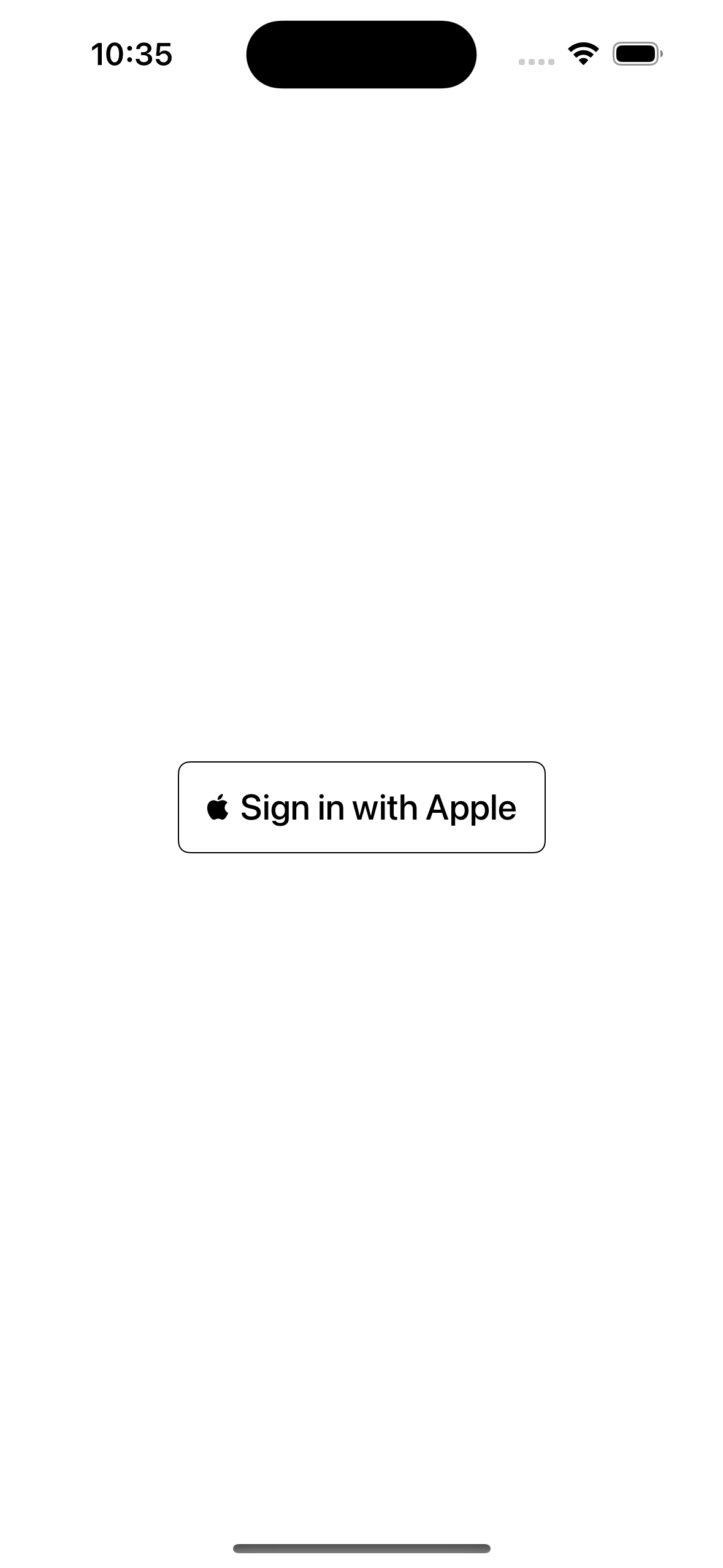
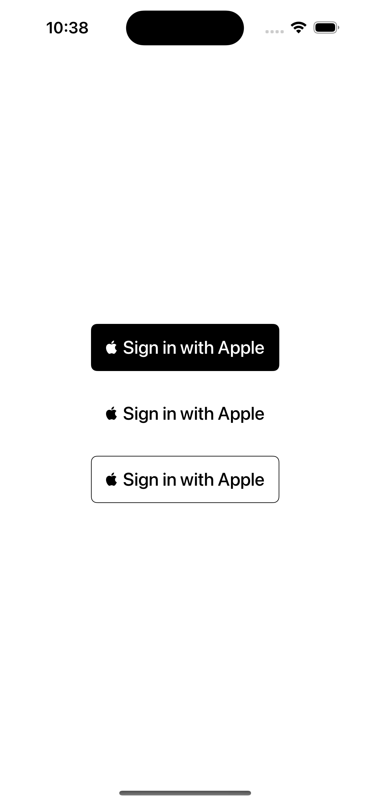
SignInWithAppleButton 也可以使用 signInWithAppleButtonStyle 修饰器进行样式的定义,可以定义以下三种样式:
whiteOutline、black、white。
官方文档
Button | Apple Developer Documentation