SwiftUI之实现App Store的Hero动画
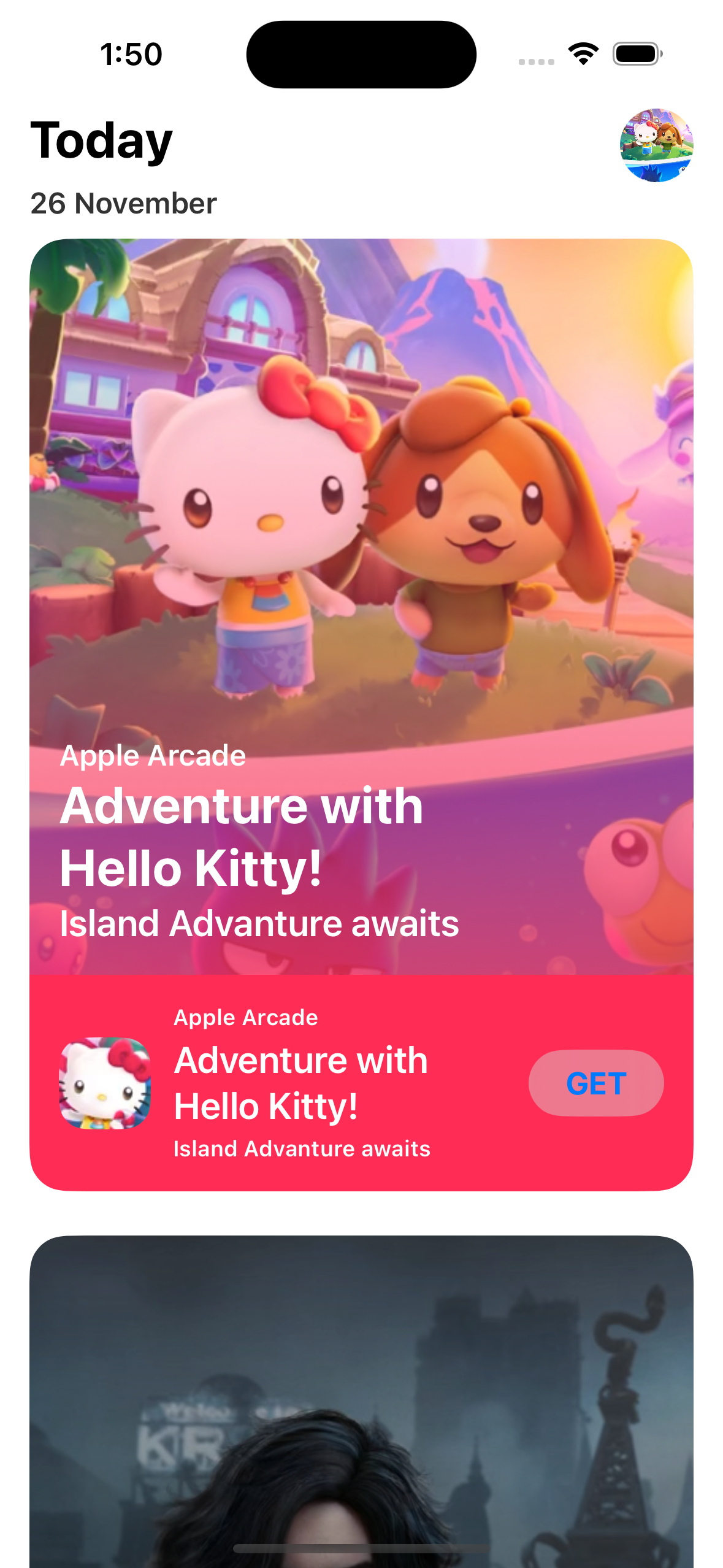
最终实现的效果如下:
创建头部视图
定义一个名为HeaderView.swift的文件,在这个文件里面编写头部视图的代码:1
2
3
4
5
6
7
8
9
10
11
12
13
14
15
16
17
18
19
20
21
22struct HeaderView: View {
var body: some View {
VStack(spacing: 30, content: {
HStack(alignment: .top ,content: {
VStack(alignment: .leading ,spacing: 8, content: {
Text("Today")
.font(.title.bold())
Text("26 November")
.font(.callout.bold())
.opacity(0.8)
})
.frame(maxWidth: .infinity, alignment: .leading)
Image("post1")
.resizable()
.scaledToFill()
.frame(width: 40, height: 40)
.clipShape(Circle())
})
.padding(.horizontal)
})
}
}
通过@ViewBuilder定义一个函数用来实现一个 CardView
首先,定义一个模型数据用来统一管理卡片数据:1
2
3
4
5
6
7
8
9
10struct CardModel: Identifiable {
var id: String = UUID().uuidString
var appName:String
var appDescription:String
var appLogo: String
var bannerTitle: String
var platformTitle: String
var artwork:String
var color: Color
}
定义CardView函数:1
2
3
4
5
6
7
8
9
10
11
12
13
14
15
16
17
18
19
20
21
22
23
24
25
26
27
28
29
30
31
32
33
34
35
36
37
38
39
40
41
42
43
44
45
46
47
48
49
50
51
52
53
54
55
56
57
58
59
60
61
62
63
64
65
66
67
68
69
func CardView(item: CardModel) -> some View {
VStack(alignment: .leading, spacing:0, content: {
ZStack(alignment: .topLeading, content: {
GeometryReader(content: { geometry in
let size = geometry.size
Image(item.artwork)
.resizable()
.aspectRatio(contentMode: .fill)
.frame(width: size.width, height: size.height)
.clipped()
VStack(alignment: .leading, content: {
Spacer()
Text(item.platformTitle)
.font(.callout.bold())
Text(item.bannerTitle)
.font(.title.bold())
Text(item.appDescription)
.font(.title3.bold())
})
.frame(maxWidth: .infinity, alignment: .leading)
.padding()
.foregroundStyle(.white)
.background(LinearGradient(colors: [Color.clear, item.color.opacity(0.8)], startPoint: .top, endPoint: .bottom)) // 设置渐变背景
})
.frame(height: 400)
//.clipShape(.rect(cornerRadius: 20))
.clipShape(.rect(topLeadingRadius: 20, topTrailingRadius: 20)) // 设置上边两个角的圆角
})
HStack(spacing: 12, content: {
Image(item.appLogo)
.resizable()
.aspectRatio(contentMode: .fill)
.frame(width: 50, height: 50)
.clipShape(.rect(cornerRadius: 15))
VStack( alignment: .leading, spacing: 4, content: {
Text(item.platformTitle)
.font(.caption.bold())
Text(item.bannerTitle)
.font(.title3.bold())
Text(item.appDescription)
.font(.caption.bold())
})
.foregroundStyle(.white)
Spacer()
Button(action: {
}, label: {
Text("GET")
.fontWeight(.bold)
.foregroundStyle(.blue)
.padding(.vertical, 8)
.padding(.horizontal, 20)
.background {
Capsule()
.fill(.ultraThinMaterial)
}
})
})
.padding()
.background(item.color)
.clipShape(.rect(bottomLeadingRadius: 20, bottomTrailingRadius: 20))
})
.padding(.horizontal)
.padding(.bottom)
}
在 ContentView 页面将HeaderView和CardView进行组合
首先,定义一个元素类型为CardModel的数组:1
2
3
4var cardItems: [CardModel] = [
CardModel(appName: "Hello Kitty Island Adventure", appDescription: "Island Advanture awaits", appLogo: "logo1", bannerTitle: "Adventure with Hello Kitty!", platformTitle: "Apple Arcade", artwork: "post1", color: Color.pink),
CardModel(appName: "Lies of P", appDescription: "Deception Shatters Innocence", appLogo: "logo2", bannerTitle: "Lies of P", platformTitle: "Apple Arcade", artwork: "post2", color: Color.black),
]
接着,就是在ContentView的body部分进行布局:1
2
3
4
5
6
7
8
9var body: some View {
ScrollView(showsIndicators: false, content: {
// 头部
HeaderView()
ForEach(cardItems) { item in
CardView(item: item)
}
})
}
此时的效果如下:
自定义一个按钮样式
首先将CardView作为Button的label部分进行包裹,让它可以被进行点击:1
2
3
4
5
6
7
8ForEach(cardItems) { item in
Button(action: {
}, label: {
CardView(item: item)
.multilineTextAlignment(.leading)
})
}
接着就是通过实现ButtonStyle实现一个新的按钮样式:1
2
3
4
5
6
7struct ScaleButtonStyle: ButtonStyle {
func makeBody(configuration: Configuration) -> some View {
configuration.label
.scaleEffect(configuration.isPressed ? 0.94 : 1) // 添加点击之后的缩放效果
.animation(.easeInOut, value: configuration.isPressed)
}
}
然后将CardView外层的button添加这个风格:1
.buttonStyle(ScaleButtonStyle())
此时,当我们再次点击任意一个CardView后将会有一个缩放的效果。
显示详情页
首先,删除添加到CardView中ZStack的下面两个修饰器:1
2.padding(.horizontal)
.padding(.bottom)
在头部定义两个状态变量:1
2 var currentModel: CardModel?
var showDetail: Bool = false
给CardView添加一个scaleEffect修饰器:1
.scaleEffect(currentModel?.id == item.id && showDetail ? 1.0 : 0.90)
在按钮的action部分使用withAnimation添加动画:1
2
3
4withAnimation(.interactiveSpring(response: 0.6, dampingFraction: 0.7, blendDuration: 0.7)) {
currentModel = item
showDetail = true
}
给ScrollView添加一个overlay,然后在里面显示详情页面。1
2
3
4
5
6.overlay {
if let currentModel = currentModel, showDetail {
DetailView(item: currentModel)
.ignoresSafeArea(edges: [.top]) // 忽略顶部的安全区
}
}
DetailView依然使用函数的方式实现:1
2
3
4
5
6
7
8
9
func DetailView(item: CardModel) -> some View {
ScrollView(.vertical, showsIndicators: false) {
VStack {
CardView(item: item)
}
}
.transition(.identity)
}
在头部定义一个Namespace的变量:1
var animation
将这个变量给到CardView:1
.matchedGeometryEffect(id: item.id, in: animation)
此时点击CardView的话已经能看到一个简单的动画效果了。
新增一个状态变量用来记录当前是否是详情页面:1
var isAniamtionView: Bool = false
当DetailView页面出现的时候将这个值赋值为true,即:1
2
3
4
5.onAppear {
withAnimation(.interactiveSpring(response: 0.6, dampingFraction: 0.7, blendDuration: 0.7)) {
isAniamtionView = true
}
}
另外就是隐藏其他的CardView和取消底部的圆角,即给ForEach的 Button添加opacity修饰器:1
.opacity(showDetail ? (currentModel?.id == item.id ? 1 : 0) : 1)
修改CardView的clipShape修饰器:1
.clipShape(.rect(bottomLeadingRadius: isAniamtionView ? 0 : 20 , bottomTrailingRadius: isAniamtionView ? 0 : 20))
在DetailView的右上角添加一个关闭的按钮,点击后关闭详情页。这里可以使用添加一个overlay来实现:1
2
3
4
5
6
7
8
9
10
11
12
13
14
15
16
17
18.overlay(alignment: .topTrailing ,content: {
Button(action: {
withAnimation(.interactiveSpring(response: 0.6, dampingFraction: 0.7, blendDuration: 0.7)) {
isAniamtionView = false
}
withAnimation(.interactiveSpring(response: 0.6, dampingFraction: 0.7, blendDuration: 0.7).delay(0.05)) {
currentModel = nil
showDetail = false
}
}, label: {
Image(systemName: "xmark.circle.fill")
.font(.title)
.foregroundStyle(.white)
.padding(.trailing, 12)
.padding(.top, 36)
})
})
接着,给DetailView的详情页面添加内容介绍。在DeatilView的CardView下面添加介绍和分享按钮:1
2
3
4
5
6
7
8
9
10
11
12
13
14
15
16
17
18
19
20
21
22
23
24VStack(spacing: 25, content: {
Text(dummyText)
.multilineTextAlignment(.leading)
.lineSpacing(10)
.padding(.bottom, 20)
.padding(.horizontal, 10)
Divider()
Button(action: {
}, label: {
Label(
title: { Text("Share Story") },
icon: { Image(systemName: "suqare.and.arrow.up.fill") }
)
.foregroundStyle(.black)
.padding(.vertical, 5)
.padding(.horizontal, 25)
.background{
RoundedRectangle(cornerRadius: 10, style: .continuous)
.fill(.ultraThinMaterial)
}
})
})
到此基本的动画效果就完成了,后续可以给介绍的文字也添加动画。